Humans are visual beings, we love looking at things we find pleasing. Pair that with functionality, and you’ve got some extraordinary brilliance. American architect Frank Lloyd Wright believed that a building should not only be pleasing to look at, but connect with and enrich the lives of those inside it. And such philosophy should be behind any great design idea.
Members of this reddit group post interesting and satisfying designs for the whole internet to enjoy. They cover all fields: graphic, product, packaging, furniture design and even architecture. So feast your eyes on the best creations that brilliant designers have come up with over the years, pandas! And don’t forget to let us know your favorites.
#1 This Poster, Designed By Armando Milani For United Nations

#2 This Tissue Box

#3 Huts Made From Repurposed Boats, England

When we look at these examples of creative design, not many of us think about what was the process behind it. Like any other creative field, design has to have certain rules. Whether it’s graphic visuals, sports shoes, dining room furniture or a skyscraper, the basic do’s and don’ts are somewhat similar.
Every design must have 7 elements: shape, color, space, form, line, value, and texture. Six of these elements are pretty self explanatory, aside perhaps from value. In the world of design, value refers to the intensity of a color, whether it’s lighter or darker. Designers can use value to create the illusion of mass and volume in their work.
#4 Art Nouveau Door In Brussels, Belgium

#5 This House I Drove Past The Other Day, The Longer You Look The Cooler It Gets?

#6 Pencil Shavings Create Frilled Lizard

Naturally, color, shape and others are not all that you need for a great design. Aside from these technical details, the approach itself is more important. That’s what is called the principles of design – how all these aforementioned elements are used.
This is where the personality and creativity of the designer comes in. Some designers prefer to put usability at the forefront of their designs, others deem aesthetics as the most important principle of a successful project.
#7 Villeroy & Boch – La Boule

#8 Rook Chess Set Design

#9 Door Latch That Doubles As An Accessories Holder At A Public Restroom In Japan. Simple Concept, Straightforward Design, Elegant Execution

Don Norman, the author of The Design of Everyday Things and director of The Design Lab at University of California has written extensively about user-centered design (UCD). He deems usability of a product to be more important than its aesthetics.
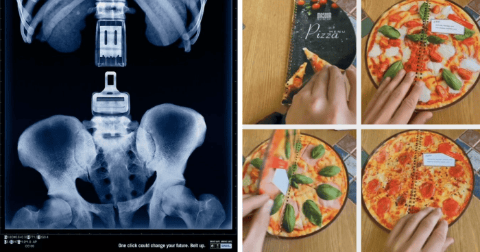
#10 Safe Drive Awareness Ad

#11 This Pizza Menu

#12 This Hour Glass With The Traffic Lights

In user-centered design, a designer’s essential task is to create objects that solve the user’s problems. The Interaction Design Foundation describes UCS as “an iterative design process in which designers focus on the users and their needs in each phase of the design process.” UCD therefore requires research on the needs of the user before any concept of a design is brainstormed.
#13 The Round-Door 1925 Rolls Royce Phantom I

#14 The Way These Cat’s Tails Are Door Handles!

#15 Alzheimer Awareness Ad

Some examples of UCD real-life examples include memory foam, developed by NASA, the Oral-B kids’ toothbrush and chatbots. Memory foam was created for astronauts who had to experience significant pressure from the G-Force and could adapt to any space-bound body.
#16 ‘Ballot’ Bins In Manchester To Encourage People To Not Litter

#17 It’s Only A Drain But…

#18 A Sculpture By German Sculptor And Draftsperson Karl-Henning Seemann That Doubles As A Handrail. Installed In 1981 And Remains Untitled, Is Located In The German District Of Schwäbisch Hall

The creators of the Oral-B kids’ toothbrush aimed to motivate kids to brush their teeth more – a thing all kids hate. The IDEO design team went against the common opinion that a kid’s toothbrush had to be smaller, just because kids are smaller than adults. By applying UCD, the designers came up with a brush that had a bigger handle and squishy parts for a better grip.
#19 Blaupunkt Pop 70 Sound System – 1969

#20 Found This Ad For Pressure Washing

#21 The Housing Estate Les Espaces D’abraxas, Built Near Paris In 1982

Did you know that the first chatbot was created in the 1960s? Its name was Eliza, a very basic Rogerian psychotherapist. Chatbots use UCD principles to improve the quality and authenticity of every interaction. It personalizes conversations to the user’s liking, thus embodying the essence of user-centered design.
#22 IKEA Ads (2020?)

#23 Safe Drive Awareness Ad

#24 Samurai Vodka

What about aesthetics, you say? After all, it’s common knowledge that people tend to like things that look pretty. Humans are wired to respond to visual stimulation, so an aesthetically pleasing design might distract from a faulty usability. According to the Interaction Design Foundation, studies have shown that users regard a more visually appealing design as more usable than it actually is.
#25 Honey Packaging Designed By Studio Unbound

#26 Great Advertisement Imo

#27 A Knife Holder

The golden rule, as Interaction Design Foundation states, is to use visuals to entice users: “Design’s critical functionality always comes first – an attractive product that draws users to use it for its main purpose.” Nice aesthetics are what draws people in, and what makes them stay long-term should be the functionality of the design.
#28 Inherited This Lamp From My Sister. The Toucan Lamp From Enea Ferrari, The First Children’s Lamp Made Of Plastic

#29 They Made The Old Escalators Into A Feature When Upgrading To New Ones

#30 Quite Liked This Sign I Saw In Edinburgh

Even Don Norman has changed his views on aesthetics over the years. In a revised 2013 version of The Design of Everyday Things, he admits that “aesthetics, pleasure and fun play critically important roles.” He therefore updated his previous definition to “human-centered design”. Human needs, behavior and capabilities are what good designers must have in mind.
#31 World Cancer Day Awareness Ad (2015)

#32 Alzheimer Awareness Ad

#33 Unique Shelving

#34 This Mc Donald’s Bill Board That Tells The Time

#35 The Picture Of The Japanese Movie Advertisement Is Printed On Two Sides Of The Newspaper, So The Full Picture Could Be Seen Under Light

#36 This Bench

#37 Volvo Ad

#38 Safe Drive Awareness Ad

#39 Frozen Pizza Box Let’s You Easily Detach The Instructions

#40 A Simple Mountain Napkin Holder

#41 This Brick Looks Like Wood To Me

#42 Cover Of Kafka Masterpiece

#43 This Store Sign

#44 Land Rover – Passport Stamps – 2011

#45 The New Cover Of The Time Magazine

#46 Finnish Company “Kiilto” Logo Uses Typography To Form The Flag Of Finland

#47 Eye Disease Awareness Ad

#48 This Waterbottle With A 3D Matterhorn

#49 The Westin Bonaventure Hotel, La

#50 Ad For Heinz Ketchup
